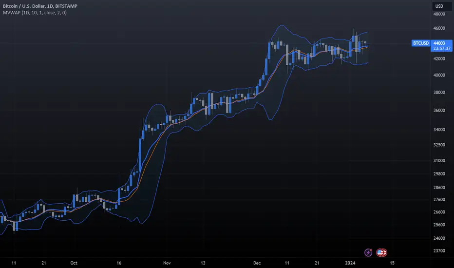
Tickers PanelCONCEPT
It's a very straight forward panel with tickers for both BTC and ETH (you can switch in the settings).
The background colouring changes based on how individual markets are trading compared to a market average.
It shows green if a market is trading above the average price and it shows grey if it's trading below the average.
This makes it easy to spot which markets are cheap/expensive.
This is jus a random idea, but the source code is open so that you can make your own changes if you like.
FEATURES
Tickers for six different markets.
By default it shows BTC prices, but you can also choose for it to show ETH prices.
Sometimes it gets blocked by price.
So there's an option to put it at the bottom of the screen.
There's more possible, just look at the source code.
I use a widescreen so for me the size of the boxes is perfect, but if you're on different resolution it might look weird.
Also if you split your screen in half for example it probably won't perfectly fit anymore.
In the settings you can easily change the colours, width, height, border thickness, ...
So yeah, just a fun panel with some crypto tickers.
Have a look at the source code it's pretty easy to understand, have fun playing around with it.
The indicator is free so just add it to your favourites and you can start using it (you might have to refresh Tradingview before it works).
Cheers.
[i]price

Horizontal line for Market open price by NB(ENG)
Since meaningful movements starts based on the first bar of the market's opening time
(usually GMT + 0), this indicator is creat to be used as a tool to use it as support and resistance.
Look at the bar of just 15 minutes passed after market opened, and when the bar closed with positive candlestick then
draw horizontal line at high price, when the bar closed negative candlestick then draw horizontal line at low price.
I use diffrent colors to help visualization.
If you look these at from a distance, you can see sections that are tightly entangled and sections those are not.
This makes it possible to distinguish between strong and weak support/resistance sections.
For convenience, I put only color and transparency adjustments. No future upgrades are planned.
Thanks to ADOL_ for this great idea, and also to Bjorn Mistiaen for helping me to make the source code.
(KOR)
마켓의 오픈 시간(보통 GMT 0시)에 첫 바를 기준으로 의미 있는 움직임이 시작되기에
이를 지지와 저항으로 활용하는 도구로 쓰기 위하여 만든 지표입니다.
GMT 0시 15분 봉 마감 기준으로, 양봉이면 그 양봉의 고점을 이어 가로줄을 긋고,
음봉이면 저점을 이어 가로줄을 긋습니다. 서로 색을 달리하여 시각화를 돕습니다.
이를 멀리서 보면 촘촘히 얽힌 구간이 나오고 그렇지 않은 구간이 나옵니다.
이를 통해 지지/저항이 강한 구간과 약한 구간을 구별할 수가 있습니다.
편의를 돕기 위해 색과 투명도 조절까지만 넣어 놓았습니다.
추후 업그레이드는 예정되어 있지 않습니다.
이 대단한 아이디어를 주신 ADOL_에게 감사드리며,
소스 코드를 만들게 해주신 Bjorn Mistiaen에게도 감사를 드립니다.

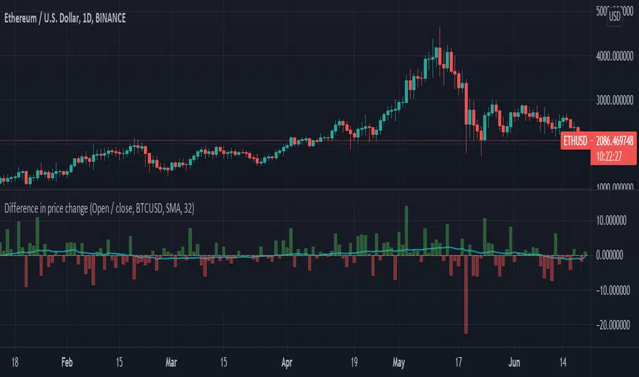
Difference in price changeCompares price change between current symbol and other one (eg. BTC vs S&P500). It calculates price change on each bar (from high to low or from open to close) and compares with price change of equivalent bar from the other source.
Example
Current symbol
open = 10 USD
close = 7 USD
change = -3 USD
% change = -30%
Second symbol
open = 3 USD
close = 4 USD
change = +1 USD
% change = +33%
Performance of price change = (-30) - (+30) = -63 // It means that current source has weaker performance right now
Relative VolatilityRelative volatility highlights large changes in price. This was designed to be used with my relative volume indicator so that traders can see the effect of volume on price action. It is also a good tool to analyse breakout patterns to identify best entry points and waves.
Above shows relative volatility and relative volume working together.

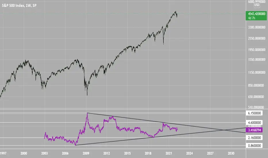
SPX Excess CAPE YieldHere we are looking at the Excess CAPE yield for the SPX500 over the last 100+ years
"A higher CAPE meant a lower subsequent 10-year return, and vice versa. The R-squared was a phenomenally high 0.9 — the CAPE on its own was enough to explain 90% of stocks’ subsequent performance over a decade. The standard deviation was 1.37% — in other words, two-thirds of the time the prediction was within 1.37 percentage points of the eventual outcome: this over a quarter-century that included an equity bubble, a credit bubble, two epic bear markets, and a decade-long bull market."
assets.bwbx.io
In December of 2020 Dr. Robert Shiller the Yale Nobel Laurate suggested that an improvement on CAPE could be made by taking its inverse (the CAPE earnings yield) and subtracting the us10 year treasury yield.
"His model plainly suggests that stocks will do badly over the next 10 years, and that bonds will do even worse. This was the way Shiller put it in a research piece for Barclays Plc in October, (which can be found on SSRN Below):
In summary, investors expect a certain return in equities as compensation for investing in a riskier asset class, and as interest rates have declined, the relative expected return for equities has increased dramatically. We believe this may quantitatively help to explain investors current preference for equities over bonds, and as such the quick recoveries we are observing (with the exception of the UK), whilst still in the midst of a pandemic. In the US in particular, we are once again observing stretched valuations and high CAPE ratios compared to history."
Sources:
papers.ssrn.com
www.bloomberg.com
The standard trading view disclaimer applies to this post -- please consult your own investment advisor before making investment decisions. This post is for observation only and has no warranty etc. www.tradingview.com
Best,
JM
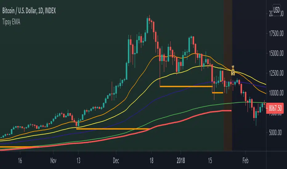
Tipsy EMA Tipsy EMA
v0.2a
Coded by vaidab.
A simple strategy to buy dips in an uptrend.
How to use:
- buy on trend when price retraces to the orange "buy" line and compound orders
- sell when price reaches red line (stop loss) or at 💰 (take profit)
Note that you can reverse trade on the 💰 sign for a short scalp / day trade.
Uptrend: green/red background. Danger zone: orange bg. No go zone: no bg.
Potential buys (in a clear trend): 55, 100, 200 EMA touches and
fibo retracements to .382 and .618.
Potential stop loss: when price breaks the 200 EMA (marked by a red line).
Exit signs: opposite trend divergences (RSI).
Take profit: EMA 55 crossing down EMA 100.
Use it in confluence with market structure. E.g. If 200 EMA ligns up with
past market structure, if there are whole numbers or if there's a monthly level.
Tested BTCUSDT D, 4H
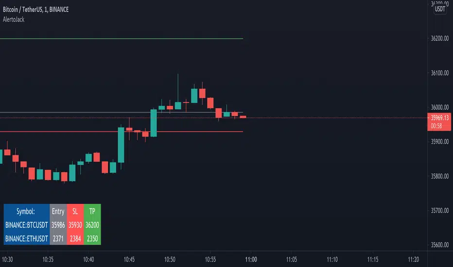
AlertoJack AlertoJack
v0.1a
coded by Bogdan Vaida
This indicator was created to provide easily defined alerts on multiple symbols.
It's still POC code.
Usage:
- Add it on any coin,
- The chart timeframe will be the timeframe for the alerts;
- Configure it with the symbols you want to be alerted on,
- Add the prices to be alerted for,
- Use Add Alert -> condition AlertoJack -> "Any alert() function call"
- Check the Alerts log.
Notes:
- Alert happens when candle crosses the price.
- Because of how Trading View functions, if you modify the indicator settings
you'll need to add the alerts again (because an alert uses the code version
it was created from).
- The alert runs once per current bar's timeframe (e.g. once per minute
if you're on the 1m).
Gridimus MaximusGridimus Maximus draws N grid lines stepping by price or percent in chosen direction from set price, or draws N grid lines stepping by pivots.
The queue function method used is adapted from an example provided on the PineCoders website, much gratitude to LucF for this gem!
To prevent grid lines out of range from causing chart to rescale right click on chart's price column and enable Scale Price Chart Only.
Pictured example above is using Type Of Increment: Steps By Pivot, Number Of Steps: 5.
Pictured example below is using Type Of Increment: Steps By Price, Number Of Steps: 6, Starts From Price: $10k, Steps By Percent Or Price: $10k.
Pictured example below is using Type Of Increment: Steps By Percent, Number Of Steps: 7, Starts From Price: $10k, Steps By Percent Or Price: 33%.
NOTICE: This is an example script and not meant to be used as an actual strategy. By using this script or any portion thereof, you acknowledge that you have read and understood that this is for research purposes only and I am not responsible for any financial losses you may incur by using this script!
MultiPrice AlertThis is an alert script using Pinescript version 4. This enables one to set 5 alerts (1 StopLoss, 4 Targets), on 3 different symbols, at using a single alert in the UI.
Every visible line will only appear on the symbols that are selected. After setting targets when making an alert, select this indicator as a condition. Change the name to whatever you want, usually the names of the set of tickers.
The Alert message is dyanmic showing which Symbol with each type of alert, at whatever price.
Ability to disable the targets + symbols.
Alerts work by Stop Loss crossing under price and Targets Cross Over. Enabling the "Short" Targets reverses this.
The line that is being displayed is actually the price of the asset being moved over x number of bars. I have not found a way to plot a traditional horizontal line, as the code for it uses a fixed price.
As it being a user input, it is a variable. Any help with this would be appreicated.
Alerts are set to once per bar.
Known bug that sometimes if the prices that you set are inside the current candle stick, then your alert will immeaditally fire, either change the timeframe or let it fire and wait fo
After a target is hit, I reccomend setting the alert to 0 and REMAKING the alert. You MUST REMAKE THE ALERT AFTER ANY CHANGES. This script WILL NOT CHANGE ALERTS AS YOU CHANGE SETTINGS.
TradingView Alerts are not this smart , at least I haven't found a way to do this yet.

Moving Average Buy/Sell IndicatorUsing a selected Exponential Moving Average (EMA)/Simple Moving Average (SMA) range, this indicator inserts a Long/Short (buy/sell) indicator overlaid on chart depending on the following conditions:
- LONG/BUY SIGNAL = if SMA value is less than EMA, and both the SMA and EMA are less than the current average price.
- SHORT/SELL SIGNAL = if SMA value is greater than EMA, and both the SMA and EMA are greater than the current average price.
**Intended for use with the 21 and 34 weekly moving average time range. Much more useful for long-term analysis rather than short-term analysis.**

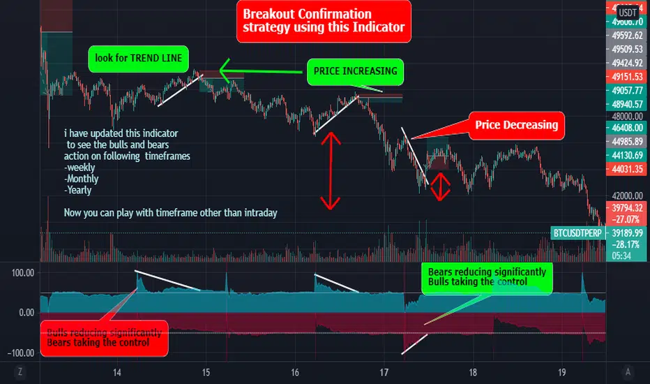
Best Bulls Bears Volume trend Breakout V2 [badshah_e_alam]This is a intraday indicator. Only to be used on timeframe less than daily charts.
This indicator purely uses volume to plot the graph. The indicator helps in conforming a breakout strategy.
This indicator is advanced version of my previously developed indicator you can check this link
Total volume is made up of buying volume and selling volume . Buying volume is the number of shares, contracts, or lots that were associated with green bars, and selling volume is the number that were associated with red bars.
The labels on the right side are the current bar value and that days bulls /bears weightage.
the first value shows the current bar volume.
second value show the bulls weight in %
third value show the bears weightage throughout the day ( %)
The Blue plot in graph keeps the track of bulls movement in intraday( %)
The Red plot in graph keeps the track of bears movement in intraday ( %)
X axis is time.
Y axis ranges from 100 to -100
I use 1:2 risk to reward ratio. Do your own research.
**not a financial advice**
Example of price increasing, volume decreasing
this indicator can be used for confirming a breakout strategy with bulls or bears in action. In the current example, the buyer’s volume percentage is reducing and the price is increasing throughout the day. Hence a breakout of the trendline is confirmation of a short trade.
Example of Price reducing, volume decreasing
example of price moving down , bears losing the grip
Example of price decreasing volume increasing
Thanks to nizar9599 for giving idea to improve my previous indicator.
DISCLAIMER
Any and all liability for risks resulting from investment transactions or other asset dispositions carried out by the user based on information received or a market analysis is expressly excluded by me.
All the information made available here is generally provided to serve as an example only, without obligation and without specific recommendations for action. It does not constitute and cannot replace investment advice. We therefore recommend that you contact your personal financial advisor before carrying out specific transactions and investments.
Do your own research, This is not a financial advice.
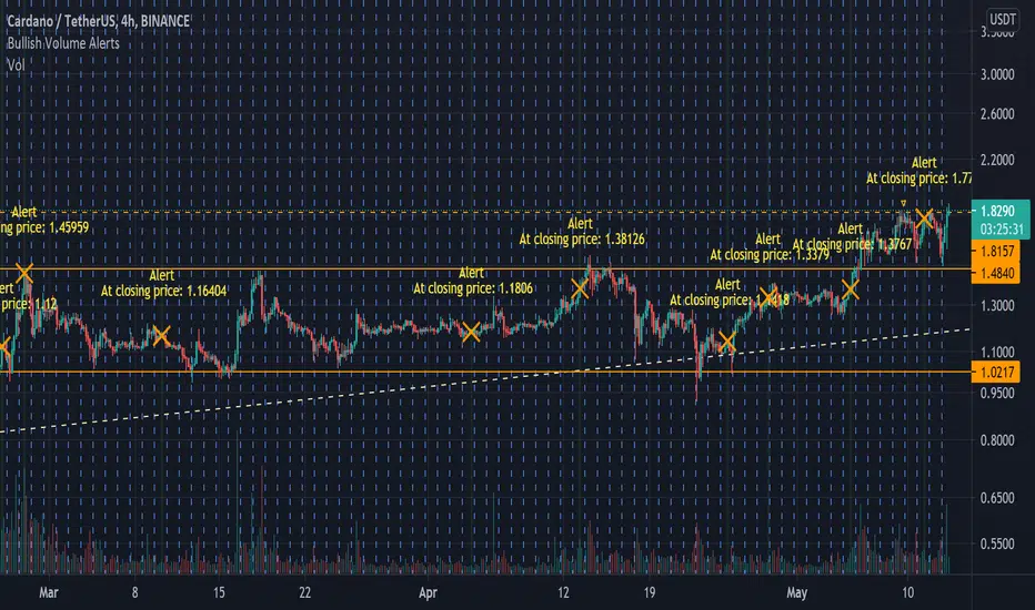
Bullish Volume [Alerts]A really simple script I made for someone, but also noticed I couldn't find anything like it that's as quick or simple (I may just be dumb)
Simply labels out and alerts you when three consequently higher volume bars appear, pretty useless on its own but for crypto, it works great to quickly notice if some important fundamentals suddenly cause the price to rocket. It works best with hour timeframes. Personally I'd use it with 4h.
I find it useful to know if something in a market is stirring attention and hope others can find it useful.
Volume using Candle RangeAnother way of finding out a rough estimate of the volume or how much bulls or bears were in control using only the range of the candlesticks in relation to the closing price. If the close is in the higher range zone then the volume is said to have been positive, if the close is in the lower range zone then the volume is said to have been negative. The close is compared to the midpoint of the candle to see how far from the midpoint the close was.
The columns bars show how far each candlestick's close price is to the midpoint of its high and low. It's possible for the column bar to be a different color than the candlestick itself if the close was above or below the midpoint. An average line is shown that takes the average of a given length amount of column bars. There is an option to show the absolute value only of the columns and the average line.
This is based on an idea I found about candlestick range bars implying volume. This is an attempt to put that theory into practice and to see if there's any truth to it. It's not exactly volume and may not always look like it, and it does not show how many trades took place but instead tries to use price in relation to the high and low range.

Price-Drive MTF Instagram LuckyNickVAFor Showing The Price Drive & The Direction Of Price & You Can Adjust It To Specific Timeframes.

Price Trend MeterYet another sweet little indicator which measures price pressure over specific period of time. I call it Price Trend Meter (PTM),
It's basically similar to the indicator 'Volume Trend Meter' (VTM) but this time the calculations are based on price rather than volume.
The indicator sums up all the prices of the green candles and red candles over a specific period of time (source and bars back can be adjusted in indicator settings).
======= Calculation ==========
For Green Column: Total price of green candles is higher than total red candles price for a specific bars back.
For Red Column: Total price of red candles is higher than the total green candles price for a specific bars back.
======= Price Trend Meter Colors =======
Green: Increasing buying pressure.
Red: Increasing selling pressure.
For the Volume Trend Meter indicator go here : https:www.tradingview.com/script/ywEEvEtI-Volume-Trend-Meter/
Stay tuned and Follow as a combination indicator of the two indicators (VTM + PTM) will be coming up next: https:www.tradingview.com/u/dman103/#published-scripts
Like if you like and Enjoy.


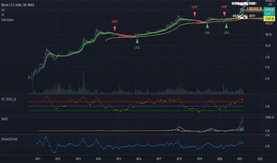
Price Extension - ln(close/20 sma)A simple script to visualize price extension. Useful to gauge tops/oversold areas. Most useful when used on weekly tf.
First Week Trend [MX]I created this indicator based on one of my ways of analyzing the BTC trend in particular, I noticed that the break of the first weekly candle usually indicates the trend for the rest of the month.
This indicator has a bug in which if you change the timeframe of the indicator it will show erroneous values
If you use the candlestick chart, you will need to pull the visual order of this indicator to the top to overlay the colors of the standard candles, or simply hide the standard candles
the trend colors are bugged in timeframes other than the weekly
special thanks to @xdecow who helped me with the code
////////////////////////////////////////////////////////////////////////
Eu criei esse indicador baseado em uma das minhas formas de analisar a tendência do BTC em específico, eu notei que o rompimento do primeiro candle do semanal costuma indicar a tendência para o resto do mês.
Esse script tem um bug em que se mudar o timeframe do indicador ele irá mostrar valores errados
Se você usa o gráfico de candlesticks, você precisará puxar para o topo a ordem visual desse indicador para sobrepor as cores do candles padrões, ou simplesmente ocultar os candles padrões
as cores da tendencia estão bugados em outros timeframes diferentes do semanal
agradecimentos especiais ao @xdecow que me ajudou no código

Combo Backtest 123 Reversal & Modified Price-Volume Trend This is combo strategies for get a cumulative signal.
First strategy
This System was created from the Book "How I Tripled My Money In The
Futures Market" by Ulf Jensen, Page 183. This is reverse type of strategies.
The strategy buys at market, if close price is higher than the previous close
during 2 days and the meaning of 9-days Stochastic Slow Oscillator is lower than 50.
The strategy sells at market, if close price is lower than the previous close price
during 2 days and the meaning of 9-days Stochastic Fast Oscillator is higher than 50.
Second strategy
The related article is copyrighted material from
Stocks & Commodities.
WARNING:
- For purpose educate only
- This script to change bars colors.

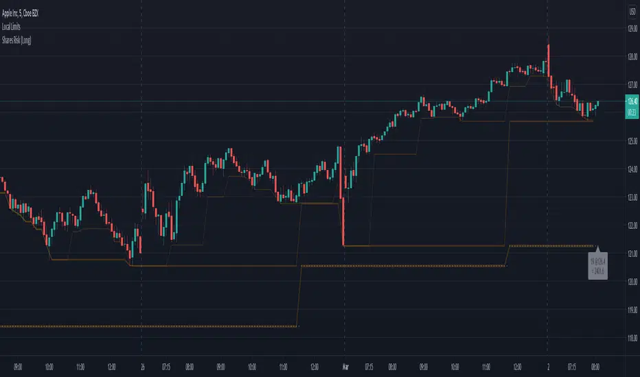
Shares Risk (Long)Ever struggle to know how many shares you should be placing your order with? Risk is different for every person and every stock. This can help.
In the example above, I've added this indicator the the chart.
I then specified:
Risk Amount ($) = $500. (The max amount I'm willing to risk.)
Risk Source = (another indicator) Lower Limit 3 . (See Lower Limits for more details)
Source Risk (%) = 0.0 (The default is 5.0 expecting the Risk Source to be the close.**)
Based upon how much I'm willing to risk, and the price difference between the close and Risk Source , this indicator will show the number of shares to purchase such that if the price drops to the stop level specified, my value loss should be limited to the Risk Amount .
333 shares is the value calculated for this example (latest bar). You can easily see how many shares you need to purchase for the lastest bar as well as track the previous values on the chart and the indicator cursor data.
---
** WARNING: There's no magic here. It's just math. So if you specify another indicator as the source, the values could get a bit strange and if the price is very close to the stop level, the number of shares could be unreasonably high. To help avoid this you can increase the minimum percent.
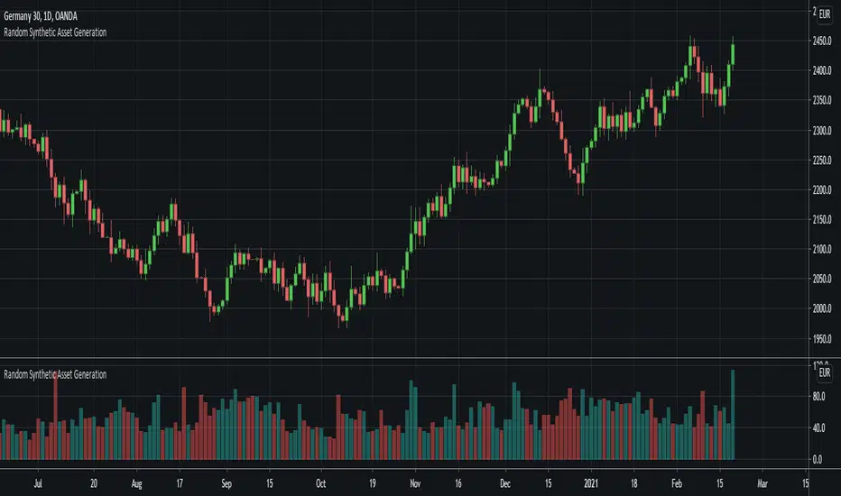
Random Synthetic Asset GenerationThis script generates pseudo-random asset data . Due to the nature of the random generator, it is impossible to use this indicator as input for other indicators because the instance of the script that the indicator is applied to will automatically be different from the instance that is plotted on the chart. Therefore, the idea is to use this script in other scripts (to make it possible to backtest on random data, for example).
The script has four main input parameters.
Random Number Generator Method: It supports two methods for generating the pseudo-random numbers (one by Ricardo Santos and one by Wichmann-Hill).
Seed: You can specify the seed to use. Each unique seed will generate a unique set of pseudo-random data.
Intrabar Volatility: This basically sets how volatile the generated wicks will be (0 = no wicks).
Price Multiplier: This is just a multiplier for the generated price data, so that you can scale up or down the generated price data.
You can also change the colors of the bars.
In addition to this, the indicator also generates random volume. In order to make it possible to show both volume and price, you need to have two identical instances of the indicator. One on the chart, and one in its own panel. Then, go into the Style tab in the indicator settings on the instance in the panel. Untick Up-Candles and Down-Candles boxes, and tick the Volume box.
In a similar manner, you can also plot the true range data and the candle change data as well, by ticking one of those boxes instead.
Distance from the ATH priceThis indicator shows us the distance (in %) between the current price and the ATH price.
The closer the price is to the ATH the higher the percentage.
100% means we reached the ATH price.
HOW TO USE:
No special input necessary.
Markets:
It can be used to all markets.
NOTE:
Some Exchanges don't go very far back in the past and for this reason this may have impact on this Indicator.
